September 2026
Version 8.7
Issue 1
Introduction
Estimate™ is an estimating tool designed to improve accuracy, customer service and efficiency during the estimating process. Accessible from any personal computer, the application incorporates measurements, diagrams, and pricing databases to create property claim estimates.
This document presents the evolution of Estimate™ throughout a modernization initiative that will span over several new releases.
Login Screen
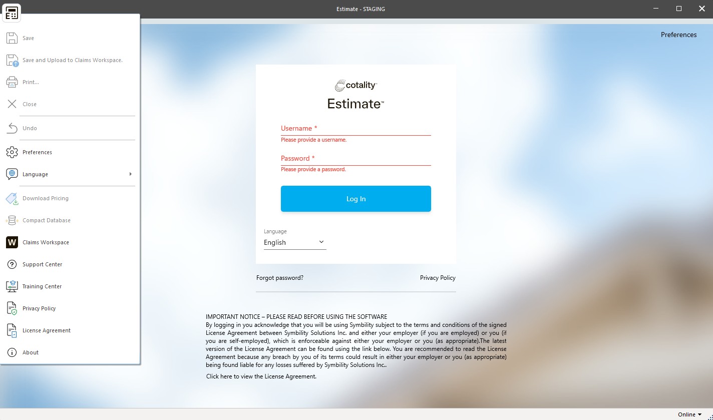
Upon logging in to Estimate™, important changes will be visible. These changes, introduced to improve the user experience, are described in this section.
Updated Header
The header has been redesigned to offer a more focused and intuitive experience. All previously disabled/grayed out tabs and command buttons at the top of the page have been removed.
The application menu, now with the new Estimate™ logo, remains on the page (and on all pages). The application menu introduces a new button, Download database. The Download database function has been moved from the Claims List ribbon to the main application menu for more convenient access.
User Interface Language Menu
The user interface language menu has been modified to offer greater flexibility and customization to the user. Users can now update the interface language directly from the drop-down menu in the center of the login page. This drop-down menu automatically defaults to the language defined in the user’s preferences and displays all available UI languages. All available languages can also be accessed from the language option within the Estimate™ application menu.
New Links
Several new links have been added to the login screen to improve navigation and accessibility for users. The Forgot your password? link is now available directly from the login screen, providing users with easy access to the Estimate™ password reset page. If the device is connected to the internet, users will be guided through the steps to reset their password. In addition, the Privacy Policy is now accessible from the login screen. A quick link to Preferences has also been introduced, allowing users to open a dialog box and make the necessary changes to their settings.
Connectivity Indicator
A new connectivity indicator has been added to display the device’s connectivity status, indicating whether the user is working online or offline. In addition, users have the option of manually switching between online and offline working. The connectivity indicator will be visible throughout the application.
Single sign-on
For companies that have single sign-on (SSO) enabled, the login box will automatically adjust accordingly and continue to function as it does now, ensuring a seamless login experience for SSO users.
Two-Factor Authentication
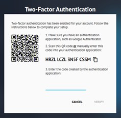
If Two-Factor Authentication is configured for their companies, Estimate™ users can complete the initial Two-Factor Authentication using a QR code generated by the system that they can scan with their authenticator application. The next time the user logs in from that same device, they will be given the option to trust the device. This will add the device to the user’s list of trusted devices and bypass the two-factor authentication for that device for the amount of days configured by the company.
NOTE: When Two-Factor Authentication and Single Sign-On are enabled simultaneously for a company, users configured to use Single Sign-On will not be prompted for Two-Factor Authentication.
Self-Unblocking User Accounts
When enabled for their company, users can unblock their own accounts after their account has been blocked due to entering the incorrect password. The user will be provided a warning message for the first three incorrect password attempts prompting them to change their password. When the user’s account is blocked following the fourth incorrect password attempt, they will receive a message informing of such and to check their email for instructions on how to self-unblock their account.
Auto-update
An auto-update prompt dialog box will appear on the login page if the user is not using the most recent version of the software. Note that a user can work using an outdated version of Estimate™, however they will be forced to work offline until they have brought the application up to date.
Synchronization & Ownership
Synchronization & Ownership underwent significant changes such as Automatic background synchronization and automated claim ownership. This section presents all the changes that have been made.
Online mode
In “Online” mode, users can open any claim with a single click. The claims list automatically synchronizes, ensuring that all data is up to date. Users also have the option of manually synchronizing their claims list if required. In addition, users can choose to make certain claims available from “Work Offline” mode, ensuring that essential claims are accessible even without an internet connection. From the claims list, users can perform a global synchronization, updating all claims simultaneously.
Work Offline Mode
When users’ login status is “Work offline”, certain limitations apply. Only claims that have been explicitly made available offline are accessible, allowing users to continue working on claims without interruption. However, users cannot open closed claims or assignments when they have the “Work offline” status.
Automatic Synchronization
When users are “Online” and have Internet connectivity, synchronizations run seamlessly in the background, ensuring that all data is up-to-date and accurate without interrupting the user’s workflow.
Upon login, a synchronization will be performed. This process involves updating company preferences and default settings, the claims list, default databases and user notifications.
When a user opens a claim or manually takes a claim offline, the system automatically downloads the claim. During this process, ownership of the claim is acquired, enabling the user to make updates. The system then downloads all items databases used for the current claim, as well as all photos and documents associated with the claim (assuming the user has the boxes in the ribbon checked to do so since the system defaults to having these options unchecked).
When the user exits a claim, the system automatically uploads the claim, ensuring that all modifications and updates are saved. Ownership of the claim is then released, making it available to other users.
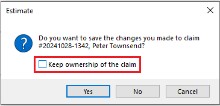
In the event a claim has been manually taken offline for 5 days, ownership will be released automatically after those 5 days. An option to make claims available offline permanently is also present providing users the opportunity to maintain ownership of a claim until they manually release ownership. Please note that any claims owned prior to release 8.0 will have the “Permanently owned” setting applied to them.
At varying time intervals, the system will check for and download updates to different parts of the application, ensuring that all aspects of the application are kept up to date:
- Every 24 hours: Downloading of Company Default Item databases.
- Every 60 minutes: Synchronization of Company configurations, preferences, and options.
- Every 30 minutes: Synchronization of the Claim List.
- Every 15 minutes: Downloading of new internal user notifications.
Synchronization Status Bar
The progress bar in the bottom right-hand corner of the Claims List has been enhanced to provide users with real-time updates on the synchronization process. This progress bar displays the current synchronization stage, giving users clear visibility of which part of the synchronization is running. It also shows the overall progress of the synchronization, enabling users to monitor the completion of the synchronization process at a glance.

Synchronization Status Dialog
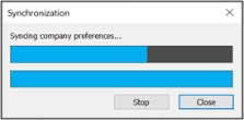
To further enhance functionality, users can now click on the progress bar to open the synchronization progress dialog. This dialog provides more detailed information on the current synchronization and allows users the ability to manually stop the synchronization while it is in progress.
Manual Synchronization
The Estimate™ platform still includes a manual synchronization function, giving users control over the synchronization process. A new button  in the bottom right-hand corner of the Claims List page enables users to force synchronization immediately. By clicking on this button, users can initiate a full synchronization at any time when they are working online.
Claim Ownership
Claim ownership is now automatically acquired and released when a claim is downloaded/uploaded, eliminating the need for manual operation. This means that users no longer need to click buttons on the ribbon to acquire or release ownership and then synchronize. As claims are uploaded or downloaded, the system manages the transfer of ownership of the user’s claim objects. In addition, the claim action column and synchronization progress bar have been updated to display claim actions as they pertain to ownership acquisition and release.
Option to Maintain Ownership for 5 Days
Estimate™ now offers the option to maintain claim ownership for up to five days. Claim ownership is automatically released after five days unless the user performs a manual release.
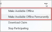
The “Make Available Offline” option is available to all companies, allowing users to access claims offline. The “Make Available Offline Permanently” option will allow claims to remain accessible offline indefinitely.
Claim List
Upon logging into the platform, the Claims List appears. Containing a list of all active claims in which the user is a participant, the Claims List is the central point where claims can be accessed and managed within the Estimate™ platform.
Claims will no longer appear in the Claims List once they have been closed or if the user has marked their assignment as completed. Note that Claims can still appear on this list if the user has toggled “View this closed claim/completed assignment in Estimate” from the Claim tab of the Options blade on the Loss Summary page.
Claims Table
The table part of the Claims List, among other things, allows users to enable options in the ribbon, select claims, see the state of a claim, and modify the table settings.

Check Boxes
Estimate™ now allows users to tick the check box next to one or more claims to be presented with the available claim actions in the top ribbon. In addition, a user working in “Online” mode can click anywhere on a claim line to trigger the claim download and automatically get ownership of that claim.
Claim State Column
This column has undergone a visual update, replacing the current folder icons with new ones representing the different states of the claim: “Downloaded”, “Not downloaded”, “Owned”, and “Temporary”. A tooltip will appear when the user hovers over these icons with their cursor, explaining what each icon represents. Please note that this column is static and cannot be removed from the claims table or relocated within the claim table.
Claim Action Column
The action column for the claim gives users visibility of pending, ongoing or completed actions for each claim. Pending describes an action that, when a user is working offline, will be completed once connectivity is reestablished. These include actions such as downloading, releasing ownership, taking offline, uploading claims, photos or documents, and participating in a claim. If there’s a problem with a claim, the column will display “Error”, and clicking on this label will show the details of the problem. Once the error has been acknowledged by the users, the “Error” label will hide. It is important to note that the “Error” label has priority over all other applicable labels, since only one label or action will display at a time.
Table Settings
The table settings have been updated to offer greater flexibility in customizing the appearance and functionality of the Claims List. Users can select which columns to display and the order in which they display in the table by enabling or disabling them in the column list. A new column option, the “Last Synch Date”, is available but will be hidden by default. The Claim Properties dialog box, where this information would have been found previously is being removed in the new UI.
Sorting has also been improved, allowing users to click on any column header to sort the list according to that column. In addition, users can resize column widths by clicking and dragging horizontally and reorder columns by dragging within the table to a new location or by using the column selection window within the list. Grouping options are also available, allowing users to group claims according to various criteria, or to leave the list ungrouped.
Claim Ellipsis Menu
The claim ellipsis menu continues to support the claim actions available on the ribbon.
Please note that the ability to flag a claim has been removed from the new user interface.
Ribbon
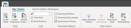
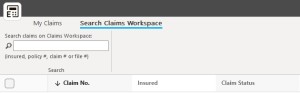
The Estimate™ interface has been simplified, with tabs reduced from four to two: My Claims and Search Claims Workspace. The remaining buttons and options have also been refined with fewer icons.
My Claims Tab
This tab now contains four sections that have been optimized for ease of use.
Claim
The main buttons in the Claim section remain in their current location and retain their existing function. Users can still create new or temporary claims and have quick access to the last 10 claims they have accessed.
Find
The Find functionality, previously located under the View tab (that has been removed), retains its existing behavior. Users can search the claims table using a drop-down list that displays their last 10 search queries. By entering a query in the Search field and pressing the Enter key, the corresponding result will be highlighted in the claims table and the box to the left of the claim will be checked. Pressing the Enter key again will take the user to the next matching result.
Download Options
The platform now offers greater flexibility with Download Options, allowing users to automatically download photos and/or documents when synchronizing with Claims Workspace™. The “Download Photos” and “Download Documents” options have been separated from the previous combined checkbox under the former Miscellaneous tab. If voice annotations exist (from old claims), they will be downloaded when the “Download Documents” option is selected, although new voice annotations are no longer supported.
In addition, “Synchronizing Pricing” is enabled by default, ensuring that pricing databases and pricing database updates are automatically downloaded during synchronization with Claims Workspace™.
Claim Actions
The Claim Actions section remains hidden when no claim is selected. Once a claim selection is made via the checkboxes, the same four buttons appear, activated according to the status of the selected claim(s). Only the relevant options will be available based on ownership and participation status. The following options are available:
- Make available offline: This option allows users to maintain ownership of a claim for 5 days that they don’t already currently own on the device they are working from, enabling them to make modifications to the claim with or without connectivity.
- Release ownership: This option allows users to maintain ownership of a claim for 5 days that they don’t already currently own on the device they are working from, enabling them to make modifications to the claim with or without connectivity.
- Download claim: This action allows users to download a read-only copy of the claim to their device.
- Stop participating: This option removes the user from participation in a claim, deleting the claim from the user’s claims list in both Estimate™ and Claims Workspace™
Search Claims Workspace Tab
The “Search on Claims Workspace” functionality has been relocated from the bottom of the page to the ribbon, but its functionality remains the same. Users can search Claims Workspace™ via Estimate™ by entering an insured’s name, policy number, claim number or file number. Pressing the Enter key will execute the search, provided there is an active Internet connection, as this function is not available in offline mode.
Claim Navigation
Claim navigation has been enhanced, offering users a simplified and improved experience.
Header/Title Bar
The Estimate™ header bar provides key navigation tools and quick access options. The Back to claims button allows a quick return to the Claims List, making it easy to switch between claim details and the Claims List.

Quick access buttons include functions to “Save”, “Save and upload” and “Undo” the latest action. The claim number and the insured name will always display in the header/title bar while company/initiator will only display if the claim is being viewed by an assignee and the assignee is outside of the originating company. Note that the Print button has been removed from header/title bar but remains accessible from the Estimate™ application menu.
On the right-hand side of the header/title bar, users will find:
- Their username, which they can click to log out of Estimate™.
- The Notifications icon (illustrated by a bell) that takes them to the Notifications blade, where unread notifications are displayed.
- The Help icon (illustrated by a question mark) that provides direct access to the Online Help section.
- The Calendar, if enabled for their company, that provides quick access to the calendar functionality.
Secure Claim Indicator
An indicator  informing users that they are working in a secure claim will be visible in the header/title bar if their company has the “Secure Claim” feature enabled and when it is enabled for the claim. This indicator is present on all claim pages.
Ribbon
The ribbon has been modified to improve ease of use by reducing the number of tabs and reorganizing the buttons within each tab. New icons have been introduced throughout the application to create a modern, consistent look. The ribbon is also dynamic, meaning that tabs and buttons change according to the page or section the user is viewing in a claim.
Page Content
The content of the page varies according to the selection made in the Claim Navigation menu. By default, when opening a claim, the Loss Summary page is displayed. As users navigate through the claim, the content displayed automatically adapts to reflect their actions.
Footer
If there are alerts related to the claim, an alert indication will appear at the bottom left of the footer. In addition, the footer shows the user’s connectivity status, indicating whether they are online or working offline.
Claim Navigation Menu
The Claim Navigation menu/panel location can now be customized by the user through various options.
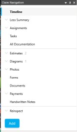
Menu threads have been reorganized and icons have been removed. In addition, an Add button has been included, allowing users to quickly add new objects to a claim, such as an estimate, diagram or photos.
Menu Location & Visibility
The Claim Navigation menu now offers flexible positioning options, allowing users to customize the interface according to their preferences. When clicking the downward pointing arrow, users can choose to float, dock or automatically hide the menu. In addition, the menu can be pinned or unpinned. The width of the menu is also adjustable.
Main Claim Nodes
The main claim nodes act as the main tabs in the workspace, making it easy to navigate through the key aspects of a claim. The main claim nodes (that will be explained in further detail later in the document) are:
- Timeline
- Loss Summary (Can be expanded, allowing to navigate directly to the various sections of the Loss Summary page, such as general information, reports, policy and custom fields)
- Assignments (Will display all assignments and sub assignments in tree format when assignments section is expanded)
- Tasks (All current behavior is maintained and will only show when the Tasks feature is enabled for the user’s company)
- All Documentation
Individual Claim Object Drawers
Individual claim object drawers are now organized in the following manner:
- Estimates
- Diagrams
- Photos
- SmartScope (if enabled)
- Forms
- Documents
- Payments (if enabled)
- Handwritten Notes
- Reinspect (if enabled)
- Integrations
A number next to each drawer indicates the number of objects that exist within that folder (revisions for estimates and diagrams are not included in this count). The objects contained in these drawers are color-coded according to their status, following the same visual cues as in Claims Workspace™. As an example, a completed estimate will be displayed in green, and the icon may update based on whether the estimate is finalized, approved or neither.
Objects owned by the user are marked with a small blue circle in the corner of the icon, allowing visual identification of ownership. Users can reorganize sub-items within each category using the drag-and-drop function.
For each claim object, there is now a dedicated page for the user to be able to view all those specific claim objects in one holistic view, that is all estimates, diagrams, photo folders, documents. Each of these claim object pages will have dynamic ribbons that will house buttons to add, import and/or download new objects and/or folders for those objects. The page can be organized in card view or list view, as well as grouped by assignment, company, or object type.
Add Button
The Add button has been centralized to simplify the process of adding new objects to a claim. The right-click functionality previously utilized for adding new claim objects from the claim navigation tree has been eliminated. The Add button also supports the association of assignments, ensuring that objects are linked to the relevant assignments.
Notifications
This section presents the numerous enhancements that are now visible with regards to notifications.
Bell Icon
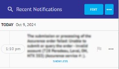
 The new Bell icon is strategically located in the header throughout the Estimate™ platform. When there are new or unread notifications and announcements, a red indicator will appear on the bell icon, alerting users to check their notifications. If all notifications have been read and there are no new ones, the indicator will not appear, giving users a clear visual cue as to the status of their notifications. By clicking on the Bell icon, users open the Notifications blade, where they can view and manage all their notifications.
Search
A new search functionality has been integrated into the Notifications blade, allowing users to search for keywords in all their notifications. This feature will filter the list to show only results matching the search criteria.
Edit Button
The introduction of the Edit button allows users to control the management of notifications. By clicking on this button, users can activate the “Edit” mode, where checkboxes appear next to each notification. This allows users to select one or more notifications simultaneously. Once the desired notifications are selected, users can perform various actions on all selected items at the same time.
Ellipsis Menu – All
The Ellipsis menu offers users additional options for managing their notifications. Located in the notification blade, the Ellipsis menu offers filtering options for the entire notification list, enabling users to sort and display their notifications according to specific criteria. In addition, users can perform actions on the entire notification list via the Ellipsis menu.
Ellipsis Menu - Single
For individual notifications, the Ellipsis menu offers targeted actions. Users can mark a specific notification for follow-up or special attention. In addition, this menu can be used to perform other actions on a single notification.
Timeline
Changes to the Timeline page and its behavior are presented here.
Ribbon
Changes to the ribbon include a redesigned New Entry button and a new Filter button that replaces the previous filter options.
Home Tab
Timeline and Filter sections are available from the Home tab.

Timeline
The Timeline section houses the New Entry button. Clicking this button opens the New Timeline Entry dialog box for entering a new manual timeline entry.
Filter
A new Filter button replaces the previous two filter options (show all or show only manual entries) and opens the Timeline filter dialog box, similar to the one used in Claims Workspace™.
Creating a Manual Timeline Entry
To create a new manual timeline entry, users can now click the New Entry button from the ribbon or click anywhere in the New Entry section in located in the Timeline to open the New Timeline Entry dialog box, thus launching a new entry process.
The process for creating a manual timeline entry remains the same, although with a few adjustments. The “Capture signature” option has been removed, as have the two send options previously available. All entries are now added immediately if the user is “Online”.

Creating a Manual Timeline Entry from Any Claim Page
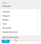
Timeline entries can also be created from any page within a claim. This can be done via:
- The Add button in the Claim Navigation panel
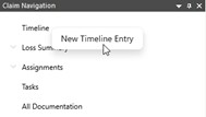
- A context menu option, “New Timeline Entry”, which appears when users right-click “Timeline” in the Claim Navigation panel
- A keyboard shortcut (Ctrl+Shift+E)
Timeline Entries Properties
Timeline entries in Estimate are sorted by date, simplifying users’ navigation through the chronological order of the claim history. Each individual entry can be clicked on to open the Timeline Entry Properties dialog box, which provides detailed information on that specific entry.
Search & Filter
Search and filter functionality has been enhanced with a magnifying glass icon that opens a keyword search field in the Timeline title bar. Users can search even when the list is filtered, and the search will focus on keywords contained in the entry text, the author’s name, the author’s company, and the author’s assignment name. If multiple words are entered, the search will only look for exact matches. Filter settings will be saved for the user, while hitting the Clear button will reset the filter settings. When a filter is applied, the Filter button is highlighted and the Timeline title bar displays the word “(filtered)”, which can be clicked to open the Timeline filter dialog box.
Loss Summary
The Loss Summary page features organized drawers for various categories of claims information, such as general information, reports, policy and custom fields. These drawers will hide if no information to display. As an example, if no fields have been filled out in the reports section, that drawer will not appear.
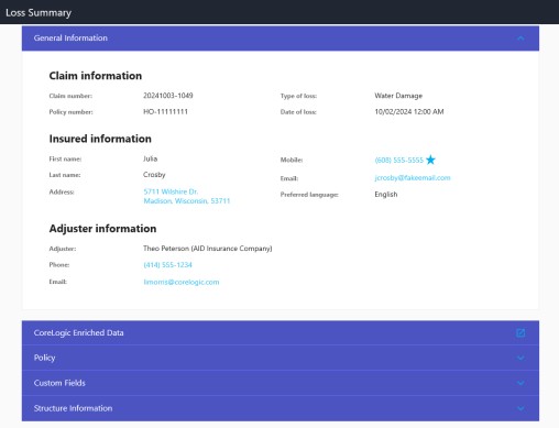
Hyperlinks have also been integrated in the Loss Summary:
- Address - Open Google Maps in a separate browser window, allowing users to view the location of the claim.
- Email - Opens an email box for writing a new email with the recipient’s address pre-filled
- Phone Number - Clicking on any of the phone number hyperlinks will initiate a phone call from your default phone program on whatever device you are using (ie normal phone call if using a mobile device or will open up a Teams phone call if using your laptop)
Ribbon
The Loss Summary page ribbon retains the existing behavior for updating claim status while offering new capabilities.
Home Tab
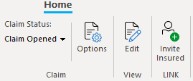
Claim, View and LINK sections are available from the Home tab.
Claim
This section of the Home tab allows users to update claim status using a drop-down menu, while clicking the Options button opens a new blade that will be accessible when working in “Online” or “Offline” mode. However, any changes requiring an internet connection, such as downloading a pricing database, will trigger an error message if made while working in “Offline” mode.
The Options blade brings together several existing options/behaviors in a new location:
- Pricing tab – Was previously located in the Claim Type/Pricing tab at the bottom of the page. It includes Claim type and Default pricingdatabases.
- Claim type follows same behavior as existing – editable until claim is first saved and synchronized, then disabled from that point.
- Estimate Totals tab – This tab represents the Claim Options button from the ribbon in old UI or the Configure claim options link from the Loss Summary screen. Displays O&P, Sales Tax, Waste, Min Charges & Depreciation settings for estimates within the claim, retaining the current functionality.
- Claimtab – This tab offers additional existing claim options to toggle on/off:
- Reinspection
- View this closed claim/completed assignment in Estimate™
Changes made in any tab will be saved by clicking the Apply button or discarded by clicking the Cancel button.
At the top of each tab in the Options blade, the claim address is displayed as a hyperlink which, when clicked, opens a new browser tab displaying the address on Google Maps. Users can save their changes by clicking on Save or cancel them by clicking on Cancel.
View
The View section houses the Edit button that activates the edit mode, allowing users to make changes to the Loss Summary. Once modifications are complete, clicking on the Edit button again saves the changes and deactivates the edit mode.
LINK
This section will be visible if LINK is enabled for the originator company. A user working online can initiate an invitation for the insured to access LINK by clicking the Invite insured button. If the claim does not already contain an email address for the insured, the user can specify one and an invite to a different policyholder/insured can be initiated from the Invite insured dialog.
Assignments
The Assignments page features a list of the assignments made within the claim, providing an overall view of the claim assignments, as well as a central location to manage assignment associated with the claim.
Ribbon
The Assignment page ribbon provides buttons to perform assignment and participant actions that were previously found in the Claim Explorer tree.
Home Tab
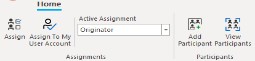
Assignments and Participants sections are available from the Home tab.
Assignments
This section of the Home tab allows the user to make assignments to other internal users, external users or vendors via the Assign button. If “Repair/Route” option is enabled by the company, the Assign button will prompt the user to make an assignment via “Repair/Route”. Also, if the enabled by the company, the Assign to My User Account button will display allowing the user to make an assignment to their own account. A dropdown menu listing all assignments in the claim provides the ability to mark which assignment should be active for the user to work within, depending on their permissions and association to the listed assignments.
Participants
This section of the Home tab gives the user the ability to add a participant to the claim utilizing the Add Participant button, as well as to view the Participants blade using the View Participants button.
Assignment Table
The table displays a list of all assignments made within the claim. It provides four static columns showing the assignment name, when it was sent and received, as well as the status of the assignment. Clicking on an assignment from the list will open the Assignment window to provide additional details to the user.

Tasks (Embedded Claims Workspace Task Page)
The Tasks page will only appear in the claims navigation menu if it is activated for a user’s company. Otherwise, it will not be visible in the navigation menu. The tasks that appear in the list are determined by user authorizations and company settings.

The Tasks page retains the same behavior as in the previous user interface:
- Filter button: Provides options to filter the tasks displayed on the page.
- Create Task button: Opens the task creation blade on the right-hand side of the screen.
- Columns & Grouping settings: Allows users to configure columns and grouping settings on the Tasks page.
- Task selector: Allows users to select a single task or several tasks at once, depending on the actions they wish to perform.
- Ellipsis menu: Task action menu, offering task-related actions users can perform.
All Documentation
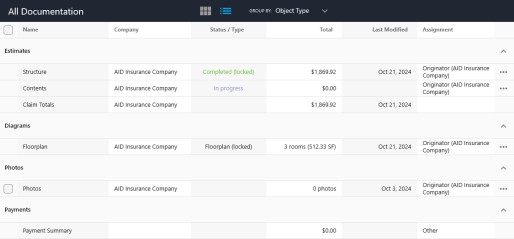
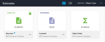
The All Documentation page is a new page where users have the ability to view and manage all claim documentation on one screen. Users have the ability to customize their view by choosing between card and list view options and to group items either by assignment, company or object type. Color coding and status indicators are integrated, with cards coded to reflect item status (such as purple for items in progress, green for items completed). A blue dot appears to the right of claim objects owned by the user, making it easier to identify their own items.
To download photos/documents (in list view), a cloud icon with an arrow allows users to click and download documents or photographs that were not automatically downloaded when the claim was first opened. Download options are also available in the Ellipsis dropdown menus of individual photos or when multiple photos are selected. On the photo gallery page and on the documents page, an icon indicates non-downloaded object cards.
Ribbon
The All Documentation page ribbon is the home of buttons that allow for the addition, importation, ownership management and downloading of all kinds of documentation related to a claim.
Home Tab
The Home tab houses four sections, Add Documentation, Import Documentation, Edit and Download that are described below.

Add Documentation
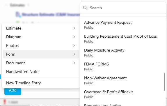
The Add Documentation section offers options for adding each type of claim documentation:
- Estimate
- Diagram
- Photos
- Form
- Document
- Payment (if enabled)
- Handwritten Note
When adding new items, users can select the assignment to which to add the new item based on the assignments in which it participates and their permissions.
When adding a Form, the available forms are presented as a list rather than the thumbnail-based browser used previously. The list shows all available forms at a glance, without the scrolling the thumbnail browser required — which is particularly useful for companies with long form lists.
Import Documentation
The Import Documentation section offers options for importing the following types of claim documentation:
- Estimate
- Diagram XML/FML
- Photo Folder
- Form
Edit
The Manage Ownership button in the Edit section of the ribbon allows users to open a dialog box in which they can acquire, or release ownership of elements linked to the assignments in which they participate and according to their permissions.
Download
The Download section houses the Download button that becomes enabled when non-downloaded items from the All documentation page are selected using the check boxes provided.
Estimates Page
The Estimates page contains a list of all estimates that have been added to a claim by all participants and it has been enhanced to provide an improved user experience.
Ribbon
The Estimates page ribbon has been updated as the Sort tab has been removed and its content relocated to the new View and Columns tabs. Materials and Payments tabs are also new.
Home Tab
The Home tab underwent several updates. In addition to the changes to sections described below, please note that the Generate Order command has been removed as well as the Download Pricing command that is still available under Configure Totals Page Layout and in the Estimate™ application menu.

Clipboard
The Clipboard section has been moved and its icons reorganized.
Search
The Search section is new and contains Search and Replace buttons.
Estimate Item
The Estimate Item section contains the existing Properties, Depreciation, Replace With and Request Information commands. A new Price Components command takes users directly to the Price Components Details dialog, helping them to quickly review or modify pricing details for that item. This command will be enabled when a single item is selected, and the user has permission to open the Item Properties dialog on the estimate.
Add
This is a new section that contains Import Items command and Add Contents command. Please note that the Add Contents command will only display in the case of a contents estimate, otherwise will be hidden.
Manage
This is a new section. It contains the existing Export to Excel command (if enabled)and now offers two new commands, Lock Estimate and Create Revision that were previously available from the right-click menu.
Audit
The new Audit section houses the Audit Report command (no longer present in the Claim Navigation) that allows users to generate and view the audit report.
Reinspect
The Reinspect section contains the Reinspect button, which will only be visible in a reinspection assignment, and will allow the reinspector to initiate a reinspection on the estimate. This has been moved from the Claim Explorer right-click menu (was available when right-clicking on an estimate, diagram or the Loss Summary). Users can also find this section and button in the Loss Summary and Diagram ribbons of a reinspection assignment.
A reinspection can also be limited to part of an estimate. The reinspector can filter by room, diagram or item category and reinspect only that portion. The reinspection report then calculates the percentage of change on the reviewed portion alone, so a change within a small reinspected area is not diluted by the total of the full estimate.
Debris
The Debris section had been relocated but retains the same functionality as before.
Insert Tab
All commands and sections present under the Insert tab have been maintained, the only change being the renaming of the Object section to Photo.
Columns Tab
This is a new tab that houses the Show/Hide section (previously located under the View tab) where users can check/uncheck boxes next to any of the column options to customize the columns displayed within the estimate page, maintaining existing behavior.
View Tab
The existing Options and Action sections remain under the View while the Show/Hide section has been moved to new Columns tab. The Options section now offers a setting that allows users to see line items reference numbers in estimates.
The View tab now includes a Sort section that has the same functionality as the Sort tab that was removed from the ribbon. The Sort section now offers a setting to sort by Line items reference numbers.
Materials Tab
This new tab will include two sections: Generate List and View List. It will display only if “Materials List” feature is enabled for a company or the current materials node is currently available to the company in the Claim Explorer.
Generate List
The Generate List section of the Materials tab houses the Generate Materials command that was moved from the Home tab.
View List
This section houses the new Select List command that allows users to view the current materials list that is available from the Claim Explorer.
Payments Tab
This new tab will be visible when the “Payments” (old) feature or the “New Payment Tracker” feature is enabled. In this case, the Add Payment command will be enabled and displayed under this new tab.
Estimate Object Menu
The Estimate Object menu displays the name of the estimate being viewed and worked on. The Dropdown menu provides additional options that were previously included in the right-click menu:
- Rename [estimate]
- Change Assignment
- Default Coverage [for the estimate]
- Recalculate [estimate]
- Delete [estimate]
ITEL Tab in Item Properties
When ITEL is enabled for the claim’s originator company, the ITEL tab is always available in the Item Properties window of an ITEL-eligible item, including items added through the API or imported from XML. Previously the tab appeared only if an ITEL order was placed as the item was added, which meant an item had to be deleted and re-added to create an order later.
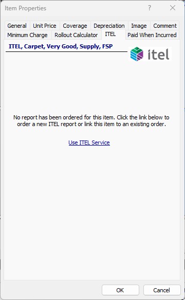
The ITEL dialog that appears when an eligible item is added also offers the option to enable or disable ITEL for that item, and defaults to enabled. Once an order exists for an item, ITEL can no longer be disabled for it.
Share Button
The Share button opens the Estimate Sharing window that provides available sharing options for the estimate depending on the originator’s sharing configurations.
In the event multiple estimates are being worked on/owned by a user, they will right click on the estimate from the Claim Navigation menu to be presented with an option to “Set as Active”. This is the only right click tool that temporarily remains in the Claim Navigation menu.
Diagrams Page
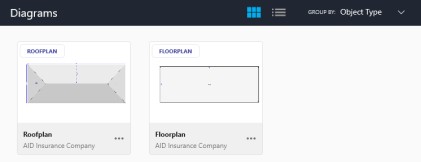
The Diagrams page shows a list of floorplans, roofplans and exterior plans that have been added to a claim. It provides diagramming tools and commands that allow users to create and or edit diagrams.
Ribbon
The Diagrams page ribbon has been updated to align with the new user experience design and includes the Home, Insert, and View tabs.
- The Clipboard section has been updated like all other ribbons.
- The number of pre-formed/saved shapes is limited to 8 options displayed, with other options available via a drop-down list.
- The Home tab will continue to update and provide contextual options based on the type of diagram being viewed and the object selected in the diagram. However, when no object is selected, the Reinspect section (if enabled, and in a reinspection assignment) and the Debris Calculator section will be displayed (only if there are line items added to that diagram that have a waste value associated with them).
- The Insert tab will show the same sections, Text, Shapes, Object and Pen and Ink and the same commands whether the user is working on a floorplan, a roofplan or an exterior plan.
- The View tab will continue to update and provide contextual options based on the type of plan the user is working on, either a floorplan, a roofplan or an exterior plan.
Floorplan Ribbon
The main Floorplan ribbon has been reorganized, simplified and now includes a Properties section:
- The Ceiling Properties (Ceiling Type) have been moved to the ribbon, where they can be modified without having to enter the Ceiling Editor mode.
- The Wall Properties, Window Properties, Block Properties, Opening Properties and Door Properties have been moved to the ribbon, where they can be modified without having to enter the Wall Editor mode.
Roofplan Ribbon
The Roofplan ribbon has been updated, reorganized, and now includes a Properties section:
- The Roof Properties button has been moved to the ribbon to provide easy access to view and make changes to roof properties from the Properties dialog.
- Skylight and Opening Properties have been added to the ribbon, where they can be easily viewed and modified.
Exterior Plan Ribbon
The Exterior Plan ribbon has been updated, reorganized, and now includes a Properties section:
- The Door Properties, Window Properties, Opening Properties and Block Properties have been moved to the ribbon.
Right-Click Toolbar and List Menu
When right clicking an object within a diagram, a toolbar appears. Options available within the ribbon at the top of the page will be brought closer within reach, based on the area of the diagram that the user selects.
Diagram Object Menu
The object menu includes several actions not available in the ribbon:
- Rename
- Change Assignment (visible only if user is participating in multiple assignments)
- Default coverage
- View related estimates
- Delete
Properties Link
To open the diagram properties, users need to click on the Properties button  and all the diagram properties will be displayed.
Panels
The Estimate Mode toggle button  will allow users to hide or show the estimating panels presented in this section.
The panels visible on the Diagrams page can be docked, undocked, relocated, and resized.
Item Database Panel
The Item Database Panel is intended to help sort and navigate an extensive database of items for estimating. This section presents the functionalities as well as the information it is providing users with.
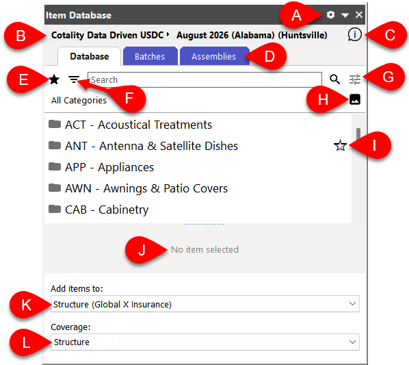
A. Items Preferences access – Click the gear icon to open the Preferences dialog. The window will open automatically to the Items tab where you can modify any of your Items Preferences, such as Automatic Note Generation, Line-Item View, etc.
B. Active Database – View the active database for the claim. For commercial claims, a dropdown will appear next to the text to allow selection of residential vs commercial databases for the selected version.
C. Request Information on a pricing database item – Click this command icon to access the Request Information link, if available for the active database you are working in.
D. Tabs – The Tabs section houses up to 4 tabs that have been reorganized from the previous icon structure:
- Database
- Item Batches
- Assemblies
- ITEL (will appear if enabled for your company and orders exist on your claim)
E. Favorites – View all your Favorited categories, items and action items in one convenient list view by clicking the star icon.
F. Item Browser Filters – Click the filter icon to access the Item Browser Filters panel to apply filters to your database searches.
G. Database Search Section:
- Search Field – Type key words in the text field to narrow down the visible database category and line-item options.
- Search Icon – Click the Search Icon to enable the search. When a search is active, this icon will convert to an X. Clicking the X will close the active search and clear the search field.
- Search Options – Click the Search Options button to display any available options for the current search (options may vary).
H. Browse Categories by Picture – Access the Browse Categories by Picture panel from this icon.
I. Favorites indicator/toggle – The star icon will appear yellow when a category, item or action item has been favorited by the user. Click the star toggle to favorite an item or remove an item from your favorite list.
J. Notes/Comments – The description of the item will appear here when an item is selected from the database.
K. Active Estimate – The current active estimate will display in the window and is the estimate that any line items will get added to. Click the dropdown to view other available claim estimates to you, the user. Selecting an estimate from the dropdown list will update the active estimate.
L. Coverage – View the selected default coverage of the diagram & diagram’s estimate(s). Update the coverage of an owned diagram by selecting an available option from the dropdown menu.
Viewing Item in Database Category
Users can navigate from a curated list directly to the database category/subcategory of a selected item. This applies when viewing items from the following curated lists:
- Searches
- Batches
- Favorites
- Related items
Users can also navigate to the database category or subcategory of a selected item from Smartpicks (US market only) or the Browse tab of the Replace With dialog window.
Applied Items Panel
The Applied Items Panel allows users to view the line items that have been applied to the diagram and added to the estimate, as well as quick access to update various properties of the line items outside of the Estimates page. The line items displayed in the panel update based on what area of the diagram is highlighted.
The following actions may be performed as needed to selected line items in the Applied Items Panel using the action buttons in the panel header.
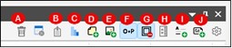
A. Delete
B. Open the Price Component Details dialog for the selected item
C. Set depreciation for the item(s)
D. Attach a note to the selected item
E. Attach a photo to the selected item
F. Toggle ON/OFF whether overhead & profit applies to the selected items
G. Toggles ON/OFF whether the selected items’ quantity includes area/linear footage for subtractions
H. Set wall height: lets you define the vertical portion of the walls that is used to calculate the item’s quantity
I. Add a title to the estimate
J. Add a line of text to the estimate
Users can also select and update the active estimate from the dropdown menu in the panel header. They can also modify the column and line item description settings from the gear icon within the panel.
Other Panels
- Browse Categories by Picture panel, that allows users to select categories in the item database by tapping on various areas in an image of a typical room in a house and view the images of the rooms in a separate panel while simultaneously being able to view the database categories.
- Quantities panel, that provides a quick cumulative view to all the various measurements and quantities associated with the diagram being accessed.
Diagramming Contextual Menu
The diagramming contextual menu, available when right-clicking on objects within a diagram, provides access to various convenient diagram tools, which will change dynamically depending on the selected diagram item.
Pan & Zoom Options
The Pan and Zoom options, previously located in the ribbon, have been moved to the bottom right-hand corner of the screen.

Floorplan Editor Mode Selector
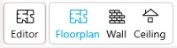
When all or a part of a floorplan is selected/highlighted, the Editor Mode selector will display providing accessibility to open the different editor modes, either Floorplan, Wall, or Ceiling, that are available for that diagram.
Panel Positioning
Panel positioning options allow users to manage and customize key panels such as claim navigation, item database, applied items and quantities, and more.
Panel Title Bar
The panel title bar provides several commands for managing panel position and behavior. The Close command allows users to collapse the panel to the side of the screen by clicking on the “X”. The Pin/Unpin command determines whether the panel is fixed or floating. When the panel is unpinned, indicated by a pin pointing to the side, it floats on the screen and users can double-click on the title bar to pin it back to its previous location. A pinned panel, indicated by a pin pointing downwards, means a fixed location. Users can click anywhere on the title bar and drag it to move it to a floating position. The Down arrow command opens a drop-down menu offering various anchoring options for panel placement.
Resize Panels
Panels can be resized by clicking and dragging on the edges, allowing users to adjust the size to suit their needs.
Docking Selectors
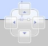 When a panel is in floating mode, the central pinning selector is displayed. Hovering over the selector highlights potential docking locations, marked in blue. By clicking on an arrow, users can make the selection. The panel is pinned in the desired position. When one panel is dragged over another, the selector offers the option of overlapping the panels, on the same side of the window.
Other docking selectors work in the same way as the central selector, for convenient access to pinning options in other areas of the interface.
Window Position menu
The Window Position menu offers several commands for controlling panel location and behavior. 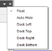 The Float option allows you to unpin the panel and move it to a floating position on the screen. Users can drag the panel to a customized position, even on an additional monitor. Anchor selectors are displayed when the panel is moved.
The Auto hide function folds the panel when not in use. The panel reappears when the user moves the cursor over the folded panel and hides again when the cursor moves away. Docking options allow the panel to be pinned to the left, right, top or bottom of the window, according to user preference. In addition:
- When Float or Auto Hide is selected, a checkmark will show next to the selected option in the Window Position menu.
- Users can pin or stack multiple panels on the same side of the window.
- Panels open with default locations.
All Photos Page
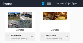
The All Photos page allows users to display all photo folders in the claim in a single page view.
Ribbon
The All Photos page ribbon provides commands for adding new photos or folders, importing photo folders, and downloading photo folders.
Page Organization
Users can choose between card view and list view to display photo folders, and group photo folders according to object type, assignment, or company.
Photo Folder Ellipsis Menu
The Photo Folder Ellipsis menu allows users to perform actions available for photo folders, either on a single folder or on several folders at once. Actions available for folders include:
- Rename
- Share
- Delete
- Change assignment that the folder is associated with
Individual Folder View/Ribbon
When users view photos in a selected folder, the ribbon dynamically updates to reflect the actions available for these photos.

Commands from the removed Edit tab have been moved to the Home tab. This tab includes commands for:
- Edit description
- Rotate
- Share
These commands only appear if one or more photos are selected via the check boxes.
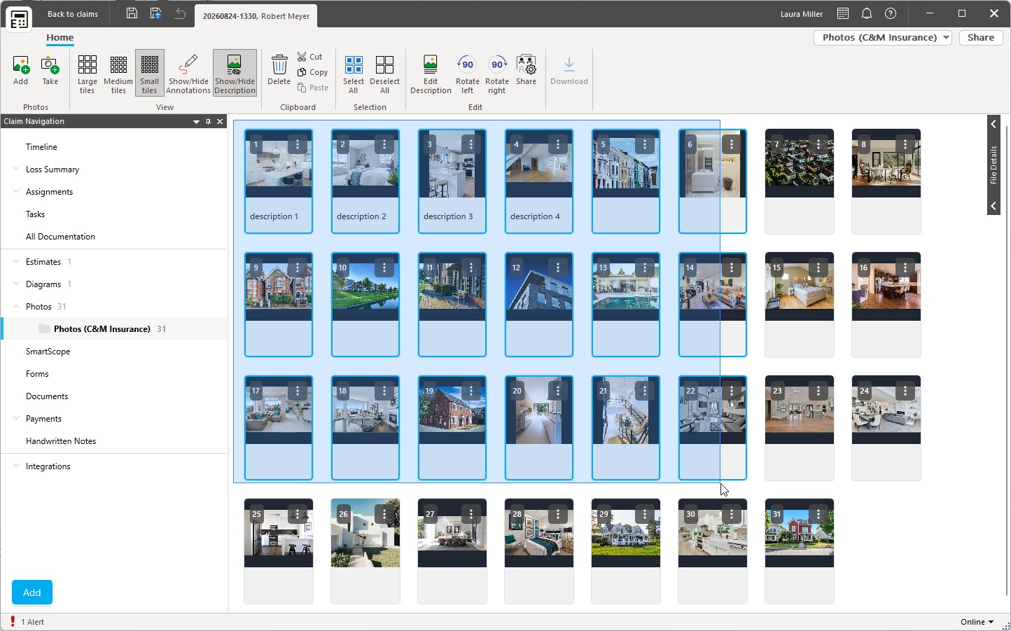
Users can also choose between large, medium and small tile display options; the number of photos displayed across the screen adjusts to the selected tile size and the size of the screen. Thumbnails now display the full photo instead of zooming in and cropping it — black space fills the area above and below or to the sides — so a photo’s true orientation is visible at a glance. Annotations can be activated/deactivated to show or hide annotations on the photos while viewed on the screen, and the Show/Hide Description option shows or hides photo captions. The setting is retained as the user moves between folders and between sessions.
The Print Layout options have been moved to the Object menu, while clipboard options have been reorganized and the Delete option added to the Clipboard section.
Check Boxes
Check boxes make it possible to select one or more photos to perform actions available in the ribbon or in the ellipse menu. When one or multiple photos are selected with the check boxes, users can drag & drop the selected photos to a new location within the order of photos to reorder them with ease. Reordering by drag & drop is now smoother, and photos keep the position they are dropped in.
Photos can also be multi-selected with the mouse by clicking and dragging across the gallery to highlight a range of photos. Selected photos are clearly indicated. Clicking anywhere on a photo selects it — holding CTRL is no longer required — and double-clicking a photo opens it in Edit mode, so a misclick no longer clears the selection. Clicking Deselect All — a new button in the ribbon, also available with the Ctrl+Shift+A keyboard shortcut — clears the whole selection, replacing the previous need to double-click Select All.
NOTE: Photos can be selected with the check boxes, by clicking anywhere on a photo — holding CTRL or Shift is not required — or by clicking and dragging across the gallery. Double-clicking a photo opens it in Edit mode.
Individual Photo Ellipsis Menu
This menu is accessible from an individual photo, offering options to perform the following actions on a downloaded photo (options to rotate, delete, cut and paste are grayed out on photos that are not downloaded). When several photos are selected, the rotate, edit description and share commands apply to the whole selection, so bulk edits no longer have to be located in the top ribbon:
- Edit description - modify photo caption/description
- Rotate (rotates photo 90 degrees to the right with each click, or 90 degrees to the left when rotating counterclockwise)
- Delete
- Share
- Cut
- Copy
Object Command Menu/Share Button
This menu displays the name of the photo folder currently being viewed and provides the following actions:
- Rename [the folder]
- Change the assignment (will only appear if there are multiple assignments with the claim and the user has permissions to access multiple assignments
- Print layout - Select the number of photos you wish to print per photo sheet
- Delete [the folder]
Photo Folder Page
This page lets you manage, edit and organize photos related to claims. It offers advanced features such as drag & drop, annotation tools and photo navigation.
Drag and Drop Capability
The drag & drop capability mirrors the functionality found in Claims Workspace™. When the user selects the Add button in a photo folder, a Drag and Drop area appears, allowing the user to add one or more photos simultaneously from a file anywhere on the device. Users can drag photos into the designated area or click on the Files link to browse their device for files to upload to the folder; the Files link opens the standard Windows file dialog. Clicking on the Claim link opens the photo window, allowing the user to select photos previously uploaded to the claim and move them to the folder. If the system detects a connected camera, the Take photos option will appear, allowing users to capture and upload images directly from their device to the claim folder.
Photo Order and Orientation on Upload
Photos now retain their original order and orientation when they are added to a claim. This applies both to photos uploaded manually and to photos that arrive through the API, so a set of photos appears in the sequence it was captured in rather than being reordered or reoriented during upload.
Photo Editor Ribbon
The Photo Editor ribbon provides tools when editing photos to include annotations, adjust the view and insert shapes or text boxes, among other things.

Back to Folder Button
The Back to folder button allows users to return to the Photo folder view from the Photo Editor view.
Annotate Section
The Annotate section has been updated to include options previously found in the Pen & Ink section. All pen and ink tools remain available with the same functionality. The Show/Hide Annotations tool has been moved from the View section, removed from the ribbon, and allows users to show or hide annotations made on the photo.
Photo Section
The Photo section of the ribbon remains unchanged, retaining all its original tools and functions.
Insert Section
The Insert section is a new addition to the Photo ribbon, replacing the Insert tab which has been removed. This section contains the existing commands for adding shapes and text boxes to the photo. Users can select shapes such as lines, arrows, rectangles, and ellipses from a drop-down menu to annotate photos. Text box tools insert a text box into the photo and display a free-form message.
Clipboard Section
The Clipboard section has been reorganized, while retaining the same commands for copying, cutting and pasting and deleting content in the Photo editor.
Pan and Zoom Options
The Pan and Zoom options, previously located in the ribbon, have been moved to the bottom right-hand corner of the screen.
Caption Box
The Caption box can now be edited directly on-screen, eliminating the need for a separate dialog box. When the user hovers the cursor anywhere in the Caption box, a quick list icon appears in the top left-hand corner of the field.
Downloading Documents and Photos
Document and photo downloads are integrated into various pages, such as the All Documentation page, the Photos pages and the Documents page, allowing users to download files using visual indicators and specific download commands.
The ribbon on the All Photos page and the Photo Folder page features updated controls for selecting and downloading photos and folders. The Select All button allows users to select all photo folders or individual photos on the current page. The Download button remains disabled until at least one folder or un-downloaded photo is selected. Once activated, clicking on this button will initiate the download of all selected items that have not yet been downloaded.
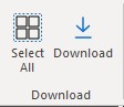
On the All Documentations and Documents page, a new Download button has been added to the ribbon. This button behaves in the same way as the photo download button. A download option has also been integrated into the ellipsis drop-down menus for photo folders and individual photo or document cards.
A download icon  serves as a visual indicator of un-downloaded items on cards in gallery mode and in List view, alongside the drop-down menu. In list view, the icon appears to the left of the ellipsis menu for each item not downloaded. The download icon is clickable and initiates the download process for the item concerned. The icon will be hidden once the item has been downloaded. It is important to know that the downloading action is also available in the ellipsis menu of individual photos, photo folders and documents.
Pan and Zoom
This function has been redesigned to improve navigation and precision when working with:
- Diagrams
- Photos
- Forms
- Handwritten notes
Pan and Zoom controls have been removed from individual page ribbons and are now located at the bottom right of the pages.

Controls
The following controls are available to users:
- Reset View (Diagram - Roofplan only)
- Selector (arrow cursor)
- Pan (hand cursor)
- Zoom Out
- Zoom Slider (new)
- Zoom in
- Zoom Options (will vary depending on page)
- Diagram & Photo
- Zoom 100%
- Zoom to Fit
- Forms
- Zoom 100%
- Fit Page
- Fit Width
- Handwritten Notes
- Page Jump
- Diagram & Photo
Users can also pan across the screen using the mouse scroll wheel.
Object Command Menus
Some Right-click menus have been deactivated and key items were organized on object page’s ribbons. The remaining items have been moved to the Object command menus in the top right-hand corner of each relevant page.
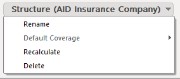
Object command menus will be present on the following pages:
- Diagram
- Estimate
- Photo folder/page
- Forms
- Handwritten notes
- Document folder
Dropdown menus
For each object-specific page, a drop-down menu appears in the top right-hand corner. The menu displays the name of the object the user is currently working on and contains options that vary according to the page.
Share button
Users will have the ability to use this button to share objects with companies, initiators, assignees and/or partners, as applicable, for the following:
- Estimates
- Photos
- Forms
- Handwritten notes
- Documents
Properties button
This button will open the properties dialog box when working on either of the following:
- Floor plan
- Roof plan
- Exterior plan
Diagramming Keyboard Shortcuts
Estimate™ supports a wide variety of keyboard shortcuts, also called hotkeys, that can be used to accelerate the diagramming process. All available keyboard shortcuts are listed below and are grouped per category.
Adding Objects Shortcuts
| Command | Diagram Type | Shortcut |
|---|---|---|
| Add block | Floorplan, Exterior plan, Wall editor | B |
| Add door | Floorplan, Exterior plan, Wall editor | D |
| Add opening | Floorplan, Roofplan, Exterior plan, Wall editor | O |
| Add skylight | Roofplan, Exterior plan | Y |
| Add triangle opening | Roofplan | L |
| Add window | Floorplan, Exterior plan, Wall editor | W |
| Toggle add (standard) room | Floorplan | R |
| Toggle add (standard) stairs | Floorplan | C |
| Toggle add gable dormer | Roofplan | E |
| Toggle add gable roof | Roofplan | G |
| Toggle add general items | Floorplan, Roofplan, Exterior plan | I |
| Toggle add last used shape | Floorplan, Roofplan, Exterior plan | Ctrl+L |
| Toggle add rectangle | Exterior plan | S |
| Toggle add triangle | Exterior plan | F |
| Toggle freeform | Floorplan | N |
| Toggle insert text annotation | Floorplan, Roofplan, Exterior plan | T |
General Object Shortcuts
| Command | Diagram Type | Shortcut |
|---|---|---|
| Copy | Floorplan, Roofplan, Exterior plan, Wall editor | Ctrl+C |
| Cut | Floorplan, Roofplan, Exterior plan, Wall editor | Ctrl+X |
| Delete | Floorplan, Roofplan, Exterior plan, Wall editor | Del |
| Flip | Floorplan, Roofplan, Exterior plan | ] |
| Group | Floorplan, Roofplan | Ctrl+G |
| Mirror | Floorplan, Roofplan, Exterior plan | [ |
| Paste | Floorplan, Roofplan, Exterior plan, Wall editor | Ctrl+V |
| Rename | Floorplan, Roofplan, Exterior plan | F2 |
| Rotate left 90 degrees | Floorplan, Roofplan, Exterior plan | Shift+Tab |
| Rotate right 90 degrees | Floorplan, Roofplan, Exterior plan | Tab |
| Select all | Floorplan, Roofplan, Exterior plan, Wall editor | Ctrl+A |
| Toggle vertex mode | Floorplan, Roofplan, Exterior plan, Wall editor | V |
| Undo | Floorplan, Roofplan, Exterior plan | Ctrl+Z |
View Shortcuts
| Command | Diagram Type | Shortcut |
|---|---|---|
| Display shape selector | Floorplan, Roofplan, Exterior plan | Ctrl+O |
| Pan down | Floorplan, Roofplan, Exterior plan | Down |
| Pan Left | Floorplan, Roofplan, Exterior plan | Left |
| Pan Right | Floorplan, Roofplan, Exterior plan | Right |
| Pan Up | Floorplan, Roofplan, Exterior plan | Up |
| Reset view | Roofplan, Exterior plan | Ctrl+R |
| Switch editor (floorplan, wall editor, ceiling editor, stair editor) | Floorplan | Ctrl+Tab |
| Toggle claim navigation | Floorplan, Roofplan, Exterior plan, Wall editor, Ceiling editor, Staircase editor | Ctrl+N |
| Toggle estimating mode | Floorplan, Roofplan, Exterior plan, Wall editor, Ceiling editor, Staircase editor | Ctrl+E |
| Toggle freeform rotate | Roofplan | Ctrl+F |
| Toggle horizontal rotate | Roofplan | Ctrl+H |
| Toggle pan | Floorplan, Roofplan, Exterior plan | Ctrl+P |
| Toggle vertical rotate | Roofplan | Ctrl+T |
| View next wall | Wall editor | Left |
| View previous wall | Wall editor | Right |
| Zoom 100% | Floorplan, Roofplan, Exterior plan | * |
| Zoom in | Floorplan, Roofplan, Exterior plan | + |
| Zoom out | Floorplan, Roofplan, Exterior plan | - |
| Zoom to fit | Floorplan, Roofplan, Exterior plan | / |
Room Shortcuts
| Command | Diagram Type | Shortcut |
|---|---|---|
| Toggle build out | Floorplan | Ctrl+B |
| Toggle join subrooms | Floorplan | Ctrl+J |
| Toggle missing wall | Floorplan, Wall editor | M |
| Toggle segment | Floorplan | Ctrl+W |
Properties Shortcuts
| Command | Diagram Type | Shortcut |
|---|---|---|
| View diagram properties | Floorplan, Roofplan, Exterior plan | Alt+D |
| View roof properties | Roofplan | Alt+Enter |
Rollout Calculator Shortcuts
| Command | Diagram Type | Shortcut |
|---|---|---|
| From wall | Floorplan | Ctrl+Shift+W |
| Horizontal | Floorplan | Ctrl+Shift+H |
| Switch layout direction | Floorplan | Ctrl+Shift+D |
| Switch seam side | Floorplan | Ctrl+Shift+S |
| Toggle show/hide layer | Floorplan | Ctrl+Shift+L |
| Vertical | Floorplan | Ctrl+Shift+T |
Photos Keyboard Shortcuts
Estimate™ supports a wide variety of keyboard shortcuts, also called hotkeys, that can be used to facilitate working with photos. All available keyboard shortcuts are listed below and are grouped per category.
Photo Gallery
| Command | Shortcut |
|---|---|
| Deselect all photos | Ctrl+Shift+A |
Photo Edit Screen (Focus is on the photo)
| Command | Shortcut |
|---|---|
| Rotate 90 degrees | Tab |
| Rotate 90 degrees counterclockwise | Shift+Tab |
| Move focus to edit description box | Enter |
| Previous | Alt+P |
| Next | Alt+N |
| Delete the photo | Del |
| Return to the photo folder | Esc |
Photo Edit Screen (Focus is inside Edit Description box)
| Command | Shortcut |
|---|---|
| Save description - Once the description is saved, the user remains on the same photo but the focus is no longer in the description box. | Alt+Enter |
| Save description and go to the next photo - Focus remains in the description box. | Alt+N |
| Save description and go to the previous photo - Focus remains in the description box. | Alt+P |
| Cancel edit description - The focus is on the photo, not the description box and all changes made to the caption are lost | Esc key |
Photo Edit Screen (Annotations selected)
| Command | Shortcut |
|---|---|
| Rotate the selected annotation 90 degrees | Tab |
| Rotate the selected annotation 90 degrees counterclockwise | Shift+Tab |
| Delete the selected annotation (then focus goes back to the photo) | Del key |
| Go to the next photo | Right arrow / Alt+N |
| Go to the previous photo | Left arrow / Alt+P |
Photo Caption Dialog
| Command | Shortcut |
|---|---|
| Go to the next photo caption | Alt+N |
| Go to the previous photo caption | Alt+P |
Was this article helpful?
That’s Great!
Thank you for your feedback
Sorry! We couldn't be helpful
Thank you for your feedback
Feedback sent
We appreciate your effort and will try to fix the article